|
1 2 |
|
|---|---|
| Posted by | Critique my art please. [New] |
|
Kaiet Cooper (#64807) Famous View Forum Posts  Posted on 2017-02-20 13:58:54 |
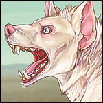
First off im not a pro so my art isn't the best in the world, Please be nice when giving me a critique. I'm still trying to find my style so these arts do differ in looks allot. i still drew them i just dont have a consistent art style. Please state which one you're critiquing, what you like about it, and what can be improved. Don't just state whats not good about it and leave it at that. That's not constructive in anyway. So i ask that you please post something you like about each piece, You can critique more than one if you want. I'm wanting to improve so i want to know what i can work on. Each picture will have a name and short description as well as the date drawn. {Human Underfell sans}{ Was completed on March 3rd 2017} Just something i wanted to sketch, this is what I think he would look like if he were human. 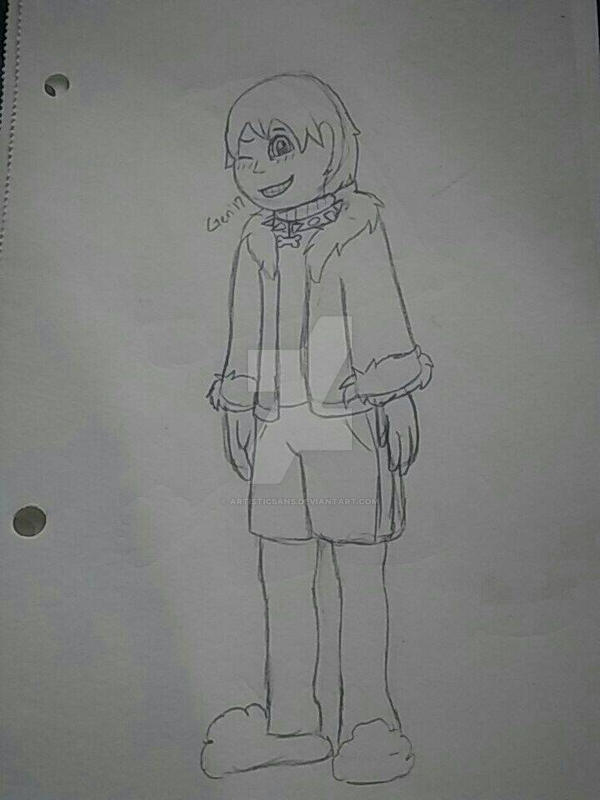 {Icon}{Was also completed on March 3rd 2017} A drawing of two of my Oc's Roman and Arial. {Collin}{Completed on November 13th 2016} Just a drawing of one of my pokemon Oc's 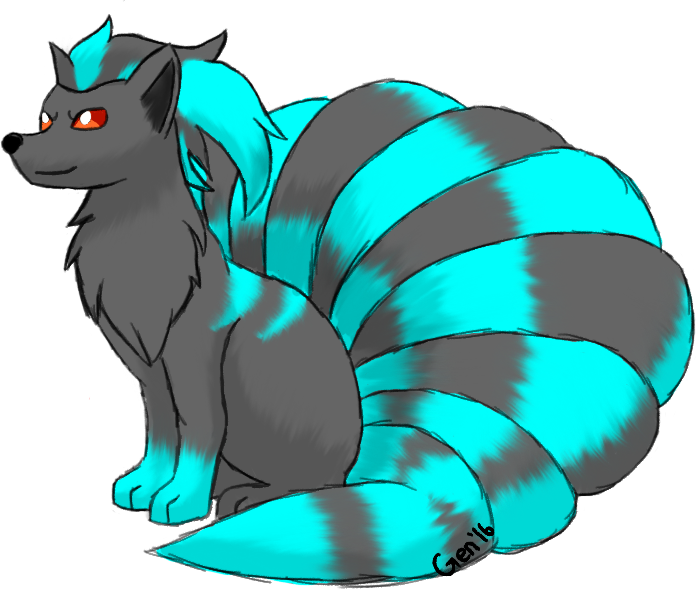 PLEASE DO NOT STEAL ANY ART ON THIS THREAD NOTHING HERE IS FOR FREE USE OR SHOULD BE USED BY ANYONE OTHER THAN ME, Thank you. these can be found on MY DEVIANTART, CHECK THE DESCRIPTIONS http://artisticsans.deviantart.com/  0 players like this post! Like? 0 players like this post! Like? Edited on 05/03/17 @ 11:49:23 by Moonshine [Obsidian King] (#64807) |
 Report
|
Kaiet Cooper (#64807)
Famous View Forum Posts Posted on 2017-02-20 14:07:45 |
BTW JUST SO EVERYONE KNOWS I have a second account. Artistic Sans #64210 So that art is not stolen on that account 0 players like this post! Like? |
|
Hawki_e (#99186)
Sapphic View Forum Posts Posted on 2017-02-20 14:10:25 |
|
Kaiet Cooper (#64807)
Famous View Forum Posts Posted on 2017-02-20 14:11:00 |
|
Hawki_e (#99186)
Sapphic View Forum Posts Posted on 2017-02-20 14:11:37 |
|
Veriah (#37395)
Deathlord of the Jungle View Forum Posts Posted on 2017-02-20 14:52:01 |
Hmm, okay. Going to start from the bottom up on this. ^^ So your last one Fire : It looks like you have a pretty good grasp of a character in motion on this one. There is not really much I can critique on this one, other then maybe try using a little translucency on the flames, and a little extra defining about the jaw line section, to give it a bit more depth. Otherwise it looks to me again like you have a good starting grasp on the flow of motion for a character in action and the start to good shading habits. On your second one Magic: Again you have a good base form going here. The angle for the muzzle is a good start, as well as the ears. Here however I do have a bit more in suggestions, as furry art is actually where I make my living from. The main things here that I see that could use some work, is the transition of colors on the tail, try smoothing them out a bit more, or moving them in out of an even black divided line, so it looks more natural. (Basically leave out inking the color transitions, so it doesn't look disjointed. ) For the hands, make sure to add some bend to the fingers where bones would be. ( Trust me when I say as an artist I HATE drawing hands. They are the main trouble area for a lot of artist. ) On the claws, try drawing them behind the finger tips, so they look more natural. Right now they look more like they are coming out of the fingers themselves instead of where nails usually connect. Usually what helps with that, is the angle you have the image drawn at, leave a bit of paw pad on the finger tips showing. So you get that natural look. ^^ Other then those, you really do look like you have a good grasp on the basics for starting out. On the first one, I am not going to offer critique. Humans are not something I dabble in often anymore. o.0;; The main things I can think to say just as a sum up: Watch your color transitions when it comes to furs, and where your bones and outlines of bones would be normally. Otherwise your doing good ^^ Hope this helps. ( Also was trying to make this as helpful and gently as I could..I get nervous when helping others with their art o.0;;; ) 0 players like this post! Like? |

|
Kaiet Cooper (#64807)
Famous View Forum Posts Posted on 2017-02-20 14:55:48 |
That really does help out allot, Thank you I know what to start working on ^_^ 0 players like this post! Like? |
|
kittenlily 🐈 (#50738)
Divine View Forum Posts Posted on 2017-02-20 15:36:00 |
hello! im not much of a human artist, but i have to say: watch the face shape. round faces are fine but it looks slightly like you drew a circle. curve the cheeks, angle the chin slightly. also; maybe blend the eyes a bit? sorry if that was harsh/unhelpful xD 0 players like this post! Like? |

|
Kaiet Cooper (#64807)
Famous View Forum Posts Posted on 2017-02-20 15:53:06 |
No no, any and all is welcome. Thank you for your views ^_^ Maily what i view as harsh or un helpful is someone saying. This art looks horrible, or something along the lines of that then not saying anything else ^_^ 0 players like this post! Like? |
|
the other Ryan (#105716)
Pervert View Forum Posts Posted on 2017-02-20 20:17:05 |
The colors are a little muddied and the forms need work as well. How long have you been drawing? 0 players like this post! Like?Edited on 21/02/17 @ 03:17:20 by Ryan (#105716) |

|
Kaiet Cooper (#64807)
Famous View Forum Posts Posted on 2017-02-20 20:17:57 |
|
the other Ryan (#105716)
Pervert View Forum Posts Posted on 2017-02-20 20:20:05 |
It seems like your drawings are advancing as time progresses so keep on keeping on 0 players like this post! Like? |
|
Lalasa (#235)
Maneater View Forum Posts Posted on 2017-02-20 21:14:47 |
WARNING: I'm not particularly good at drawing so if that nulls any critique I give, that's perfectly fine. :P But yeah, I'm going to talk about your human version of Underfell Sans. I feel like out of the three pieces presented that it's my favorite. What struck me was that you used soft outlines on his face instead of harsh black lines. I like that artistically because it makes his face look softer, and more skin-like. You also used lighter grays in his hair to give it texture, which I think was a nice choice. The shading in his eyes (the iris especially) blends the different tones of red smoothly, and I don't notice any jarring coloring mistakes, both in the eyes and in the overall picture. This make it pleasant to look at. I almost forgot to mention this, but I noticed the subtle coloring of the fur lining on his coat. It definitely captured the texture of fur quite well, so good job there! But, obviously, there are always things to work on. I feel like your line quality in that piece is a bit... shall I say lumpy? The lines don't look completely certain, like your hand wobbled during some parts when you drew him, especially around his head and neck. His facial features are also rather oddly aligned, although really the most offsetting part of said face is his mouth, which stretches unnaturally to the right on an otherwise more symmetrical face. Some shading underneath his hair would have been nice, as well as some to add more natural curves to his cheekbones and such. Adding the light grey lines to the hair, as I mentioned, was a great call, but it could have been expanded with more shading too, as there isn't a lot of definition to his hair, which makes it look rather "flat." Lastly, the sweater he is wearing under the coat looks less polished than the rest of the textures on his clothes, and the line work looks more "uncertain" than its surroundings as well, which lends it an unwanted "rushed" quality. Overall though, I think you have a good start as an artist, and that if you keep improving, you'll probably blossom into a really great one as well, with the potential to make professional-looking pieces. Even though I don't draw well myself, I hope you will find some of the things I wrote constructive. :) 0 players like this post! Like? |

|
Kaiet Cooper (#64807)
Famous View Forum Posts Posted on 2017-02-20 21:28:28 |
yeah, the lines are a bit "rushed" looking my tablet was lagging allot during this piece before it finally quit altogether. That's why they are also a bit lumpy the pen pressure didn't know what it wanted to do tbh. And just because you think you aren't good at drawing doesn't mean your opinion isn't welcome. Its honestly encouraged. I love to see how other people see things and everyone could have something different to offer in the form of a critique. And im bais to that piece too XD. Thank you very much for your feedback though and Its nice to know you see some potential in my art. Ive been working hard the last couple of years and have even started Daily drawing to challenge myself and get better. All in all your critique IS very helpful ^_^ 0 players like this post! Like? |
|
Kaiet Cooper (#64807)
Famous View Forum Posts Posted on 2017-02-22 16:02:06 |
Added new one, Replaced old one. so if anyone wants to critique it feel free to ^_^ 0 players like this post! Like? |
|
🔮 (#90700)
Usual View Forum Posts Posted on 2017-02-22 16:06:51 |
I would suggest not shading with black and highlighting with white- try complimentary cool and warm shades instead! & It appears that you use airbrush-like tools a lot which I would also suggest moving away from- there's a lot of other tools on many programs (what program are you using, if i may ask?) that offer a much larger scope for blending and such! but overall it's pretty good and I think especially the second one is really cool. 0 players like this post! Like? |
1 2 |
|---|
Memory Used: 623.16 KB - Queries: 0 - Query Time: 0.00000 - Total Time: 0.00391s