|
1 |
|
|---|---|
| Posted by | Your Art is NOT Bad! |
|
⛧August⛧ (#93898) Fearsome View Forum Posts  Posted on 2017-03-04 05:32:45 |
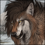
For quite a while, I've seen people belittle or insult others art, simply for not being "good." But think about it, there is no such thing as an art quality scale! Art is perceived both by the creator and by the audience, and both reactions are usually very different. Usually, the artist thinks that the art piece is horrible and the audience thinks it's great, or vice versa. Art comes in multiple, possibly endless forms! Art is a craft, and people will always tell you that you need to master that craft. The problem with that notion is that art is a continuously evolving craft and there is no limit to how much it or you can improve! Mastering art is not a true concept, there is no set definition of mastering art! Mastering art is once again a perception that you put on your finished pieces! Your perception of whether you have mastered art is an ever-changing river that will never be satisfied with one direction. One year you may think that you want to make your art look cartoonish and simple, but the next you may decide to work towards realism. Congratulations my friend, your River of Perception has just changed direction. "Well I can't shade and that makes my art bad!" The Egyptians never used shading. People still look back at their art and admire it's story and simplicity. "Everyone hates my art, I should just give up!" Walt Disney, the father of imagination himself, was not accepted into a newspaper business because he was deemed uncreative. J.K. Rowling's Harry Potter was rejected time and time again because it was decided that no one would like it. The Beatles were told that they had no future in music. They didn't give up. Neither should you. Don't believe me? Look at an old piece of art, perhaps from 2-3 years ago. Let yourself remember how proud you were of this piece. Now look at your most recent piece. What has changed? Has your style gone more cartoonish or realistic? What was your goal when you had first drawn that old piece? What is your goal now? Why don't I show you an example of my own? This piece was finished on January 29th, 2016.  As you can see, the arms are thin and the bodies are lanky. Back then, only a measly one year ago, I had wanted to have a cartoonish style. Therefore, I did not bother with texture or detail at all. This piece was finished today.  While I do still have some remnants of a cartoonish style, I have gone slightly more towards realism. The character in question has a much thicker neck, the body is no longer a straight line, and I've begun to experiment with liquids and texture, as proven by the presence of the ink and scales. In conclusion, the idea that your art is bad is absolutely wrong. Instead of comparing your own art with others by saying "his/her art is so much better" instead compare by saying "he/she has done the texture and lighting differently, so if I want to make my style cartoonish/realistic, then I should experiment with different techniques." Share an old piece of art next to a recent piece of art below and show us how your River of Perception has changed direction.  0 players like this post! Like? 0 players like this post! Like? Edited on 29/07/17 @ 19:42:09 by Crow | Father of Toony (#93898) |
 Report
|
AimPyre | G2 Jellyfish Preon (#98461) View Forum Posts Posted on 2017-03-04 06:34:01 |
*hugs* This actually helps a ton :'D This is a picture I made in 2016's New Years (just after 2015, going into 2016, I mean). Back then, the blend tool was basically my life haha. And Pokemon Art Academy. I used the blend tool for basically everything in this picture, from the sky, to the fur, to the grass. Even the purple fire. Here, Enya (the character) isn't the main focus, it's more focused on the sky and the snowy hill. The stars are much dimmer, and not rounded. Back then, though, I quite liked this piece of art. My 'river of perception' liked how the fur looked, and how small she was and how she wasn't the focus. This is the re-draw of the picture from 2017's New Years. I no longer use the blend tool for fur, I keep it more cartoon-y and flat. Enya is more the focus of this picture, as it's more zoomed in on her than the last picture. The stars are blurry, yet brighter and more rounded, but still not perfect. The sky blends together much more smoothly, and uses darker colors. My style for snow has changed, it's not just pure white, the edges of it are more of an ice-y look, but still without using shading to really define it, as my perception felt it wasn't needed for this picture. Thanks again, this has actually helped me feel more confident with my changing art style <3 0 players like this post! Like? |
|
⛧August⛧ (#93898)
Fearsome View Forum Posts Posted on 2017-03-04 06:38:47 |
You're welcome! That's the intention of this thread, to help artists feel better about their art and style. 0 players like this post! Like? |
1 |
|---|
Memory Used: 624.67 KB - Queries: 0 - Query Time: 0.00000 - Total Time: 0.00355s