|
|
|
|---|---|
| Posted by | [++] Mobile Suggestions! (90+ Supports!) |
 Lieutenant Stabby | IO | LdT | (#35974) Devastator View Forum Posts  Posted on 2015-09-10 14:38:46 |
Hello everyone! This my first suggestion thread so hopefully everything makes sense to everyone xD I couldn't find anything about what I'm suggesting but if you do, feel free to post a link to an already previous suggestion and I'll remove mine c: Alright, so this is pretty much a suggestion thread on changes I feel like should happen on mobile. 1. Move + change the Navigation Bar layout on mobile To me, that Navigation bar needs some work x.x First, it's gotta move to the left. I know some mobile users have a trouble with it being so close to the logout button that they accidentally log out (I haven't yet tho) so that'll benefit them. It also will fit well with the layout I suggest for it: Closed 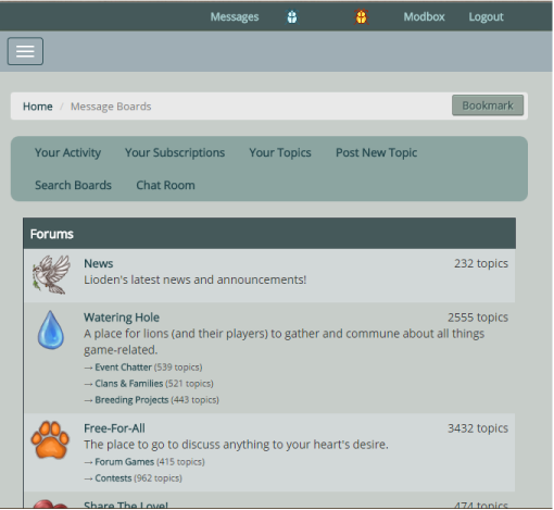 Open 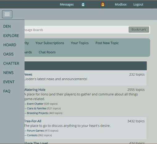 As you can see, no more giant box domination like the whole page! x.x With this setup, it will allow one to look at whatever page they are on and the Navigation Bar at the same time with ease. To simply see the full page without the Navigation Bar, just close it. Yes, I do believe this is possible to code as I've been it done on another website I'm on that I got this idea from. If it really isn't possible, can it maybe at least look something like this?:  I would really just like something a lot less bulky on my screen especially since there's quite a lot of empty space in that box, why not fill it up? Just something that isn't taking up my whole screen any more. 2. Move the Sidebar up and make it collapsible. You know that wonderful Sidebar with your hunger/energy/etc., bookmarks, chat box and such? Well, I think it needs to move upwards to be at the top of the page instead of at the bottom. I make decisions of which page I click to next based on my hunger and such and I find it a real pain to have to keep scrolling up and down to see the Sidebar and click to the next page. Besides, when you are logged out, the Sidebar has "Join for free!", Login, etc. on it instead. When the Sidebar is like that, I feel like that stuff is pretty important and should be up at the top of the page rather than shoved at the bottom. Preview of it: 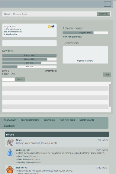 It would also be nice since that Sidebar will get pretty clunky so to help clean up your little mobile page even more, make it collapsible just like the Navigation bar where it always be closed unless you open it. Closed:  Open:  (The button to open it and close it can be on the right or left! Sorry for all the size inconsistencies, it will be formatted to fit your size of the screen.) 3. Bring back text in den descriptions Yes, I know why all the den descriptions were disabled but I feel that if I can see my background CSS coding on mobile in my den, I should be able to see the text I put in the den description. After, people write a lot of important things there! If you are on mobile, you are missing A LOT of important information. You miss information on when/why someone is away, stud information, threads people link, things people ask of you do/do not do, notices, links that are handy to go to sides, etc. Basically, you missing everything that player has to say. So I say bring back text. Let mobile users be able to use and see text in den descriptions. This will not bring back pictures! Pictures lagging pages to load properly is why this was disabled in the first place. You should have extremely basic HTML too such as italics, text align, bold, strike, links, etc. Pretty much just images being posted in den descriptions are gone. This will allow everyone to alert visitors of important information and to be able to see that important information on mobile. 4. Bring back avatars/tags For me, I'm a pretty visual person and I'm sure plenty of other people are too. In order for me to know who you are, I associate the avatar/tag you have to your name and ID. If I can't see your avatar/tag, I honestly won't recognize who you are even if I do know who are since a string of words for a username and ID isn't that helpful to me. I don't memorize everyone's ID numbers, that's excessive and I just can't really remember words without a visual since I'm a visual person. To me, it's like you tell your name and a few minutes later I won't be able to tell you what your name but I would be able to recognize your face (which does happen to me btw). I honestly don't really read threads on mobile since with no avatars/tags, it's just a bunch of words everywhere on my screen to me. To me, only one person is really talking since there isn't too much of a difference and break between people. I also use avatars/tags as a quick ref that someone new is talking so I can easily read a thread without having to take forever. If two people post with the same premade avatar/tag, I do take a moment to see if it's the same or different people talking. It's just more often that everyone has a different tag that I can visually associate the change in speakers with. Also, avatars have always been open to users to have whatever they want there (as long as it doesn't break the ToS). It allows people to express who they are in their own little way and they should be able to do that. Also, what about the money spent on that avatar? Plenty of people buy art to use as their avatar/tag and now they can't really use it on mobile. They pretty much waster their hard earned beetles on something they loved but can't have now. They should be able to see their avatars/tags since they did spend their beetles on something they wanted before the change had happened. Aaand, there's my spiel on everything, hopefully everything is covered ^^ Questions? Comments? Concerns? I'm of course open to more suggestions and I'd like to know what you guys think. Would this help out all you mobile users? Also, now with the no support button, please comment below if you don't support so I know why! Suggestions"Also adding a suggestion to be included; let us access the journal in mobile mode!!! I keep sales info and important links/wardrobe bits in there and when working (which is a lot now, yay promotions Oo) not being able to access those things gets incredibly annoyong xD" by Fieora (#26148) Pff, meant to add this other one earlier whoops: Breadcrumb suggestion on top of page 2 by Pasha and I |
 Report
|
Lieutenant Stabby | IO | LdT | (#35974) Devastator View Forum Posts Posted on 2015-09-14 05:53:54 |
|
Pasha (#5512)
King of the Jungle View Forum Posts Posted on 2015-09-15 12:55:23 |
Support! That menu drives me crazy, perhaps there should even be an option to make it non-collapsible for those of us with larger devices O_o Also, I guess this also applies to the general website layout, but in my eagerness to avoid using the collapso-menu on my phone I am always clicking the link that says "home" on the top... only to end up on a front page advertising LioDen to the obviously unconverted. Shouldn't this be replaced by your Den page or something if you're already logged in?  0 players like this post! Like? 0 players like this post! Like? |

|
Lieutenant Stabby | IO | LdT | (#35974) Devastator View Forum Posts Posted on 2015-09-15 13:38:15 |
Thanks for the support! The menu would be different on larger devices as the menu changes from how large the screen size/window is. I believe if you are using an Ipad, tablet and the like, it would probably be more like how the desktop just has a bar or even like the second example for the Navigation bar set up I have except without the collapsible part. It would probably be something like the Forums bar when I make my window smaller:  For larger devices like a tablet, and Ipad and such, wouldn't one just have the long Navigation bar though? It would seem they would have a screen large enough for it since on my laptop, I have to make my window at least ~7in in order to get the mobile drop down menu and I believe the screen for those are bigger than 7in. For the home button, I believe it's just meant to be the home page for the site which is the front page people see about the small debrief of Lioden. The breadcrumb really seems to be more of a small navigation bar to say where you are rather than to actually navigate places as it goes from saying "Home / Inventory" to "Home / Oasis" when you go from Inventory to Oasis. I think Home is just linked so that you have a way back to the default page that would be the main/front page of the site. Even though you know you went from Inventory to Oasis, it's also probably there to show what the bookmark will bookmark since the bookmark button is there. It doesn't really seem to be something to be used to actually navigate to page to page (since that's what the Navigation bar is for) but rather show what page you are on. Home's probably linked since someone is probably going to be like "How do I get to the home page?" and they probably wouldn't think to click on the logo but rather than a place that says "Home". It's also useful if you want to go to the home page on mobile as the smaller the screen, the big Lioden logo will go away. Though, I'm not 100% sure what exactly is the purpose of the breadcrumb but that's what it seems to be doing to me anyways. Maybe it would be best to add another link to the breadcrumb like how it goes on the forums:  Instead of looking like that, it would go Home / Den / Chatter / Game Development / Mobile Suggestions! (50+ Supports!) where Home, Den, Chatter and Game Development link to their respective pages and Mobile Suggestions! (50+ Supports!) will be faded to show that's the page you are on currently. Edit; Resized an image 0 players like this post! Like?Edited on 15/09/15 @ 20:43:43 by Lieutenant Stabby | IO | LdT | (#35974) |
|
Aslana (#17146)
Deathlord of the Jungle View Forum Posts Posted on 2015-09-15 13:56:55 |
YES PLEASE I LOVE ALL OF IT <3 I don't really hit the Logout button on accident when trying to hit the menu button, but I have hit the Bookmark button on accident MANY times and it's so annoying >. 0 players like this post! Like? |

|
Lieutenant Stabby | IO | LdT | (#35974) Devastator View Forum Posts Posted on 2015-09-15 14:01:06 |
Thanks for the support! <3 I feel ya, I think my main problem is mostly clicking the wrong the link in the Navigation bar xD 0 players like this post! Like? |
|
Canaan {I.R.I.S.} (#39865)
Indifferent View Forum Posts Posted on 2015-09-15 14:03:17 |
I support everything, I would really love to be able to see tags and icons a lot as I love them a lot!! <3 I only play on mobile so sometime it does get quite challenging. 0 players like this post! Like? |

|
Lieutenant Stabby | IO | LdT | (#35974) Devastator View Forum Posts Posted on 2015-09-15 14:06:53 |
Thanks for the support! Exactly! Avatars/icons/tags are great and defiantly helpful :D 0 players like this post! Like? |
|
Aslana (#17146)
Deathlord of the Jungle View Forum Posts Posted on 2015-09-15 15:45:40 |
Yeah the icon thing has been bugging me, like I tend to identify people by their icons xD like "hey it's that person! Yo!" 0 players like this post! Like? |
|
<Madison> (#67359)
Ruthless View Forum Posts Posted on 2015-09-15 15:46:48 |
|
Lieutenant Stabby | IO | LdT | (#35974) Devastator View Forum Posts Posted on 2015-09-15 16:49:28 |
Aslana- Yes, me too xD Everyone appears to be the same person to me now on mobile @@ Madison- Thanks for the support! c: 0 players like this post! Like? |
|
tokala ❅ (#28316)
Maneater View Forum Posts Posted on 2015-09-22 11:49:42 |
Support! I have these problems everytime,especially the acidentall logout. 0 players like this post! Like? |

|
Lieutenant Stabby | IO | LdT | (#35974) Devastator View Forum Posts Posted on 2015-09-22 11:59:29 |
Rin Spiritwolf (#20915)

Cursed View Forum Posts Posted on 2015-10-07 14:12:21 |
Support! I'm mobile on Lioden more then anything, it's just more convinent. I agree with your suggestion, would definitely make my world easier lol I've accidentally logged out many of times! 0 players like this post! Like? |

|
Lieutenant Stabby | IO | LdT | (#35974) Devastator View Forum Posts Posted on 2015-10-07 14:28:48 |
|
Bezthiel 🍉 (#81210)
Lone Wanderer View Forum Posts Posted on 2019-06-18 11:40:00 |
Another thought: change the GD branch sales search. I cannot use it because it wants me to scroll through all 2500+ items on the site. Basically can't use branch sales on mobile at all without the ability to type in the name of the item I want. 0 players like this post! Like? |

Memory Used: 631.62 KB - Queries: 0 - Query Time: 0.00000 - Total Time: 0.00433s