|
1 |
|
|---|---|
| Posted by | Critique my art? |
 Rusty [Interstellar 4cel 4.5k] (#39276) Heavenly View Forum Posts  Posted on 2015-06-08 04:12:26 |
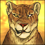
I tried a new colour method in digital art and wanted to know what people thing, how I can improve and stuff?  Then this is the same without a background :P   0 players like this post! Like? 0 players like this post! Like? |
 Report
|
shenanigans (#23653)
View Forum Posts Posted on 2015-06-08 04:15:46 |
Ah, I don't really know if I'd be the greatest at explaining what I see that could be changed, being someone trying to strengthen my art skills as well, but I can see you have a pretty good grasp on anatomy! :D 0 players like this post! Like? |
|
toyota corolla (#32767)
Bone Collector View Forum Posts Posted on 2015-06-08 04:20:18 |
Its looks pretty good already, but maybe soften the edges of the shadows and muscles on the lioness, and try to make it blend more. Same for the grass, if your going to draw every single blade, make a small background of color and then draw with a slightly lighter color over that to make the grass loom more like, well grass. :) 0 players like this post! Like? |
|
Athena (#42014)
Impeccable View Forum Posts Posted on 2015-06-08 04:23:28 |
I don't think it needs changing and I really think you did a great job with the structure and really showed the depth and background really well. (by the way if you ever sell your art let me know, I think you are really great.) 0 players like this post! Like? |
venna (#15577)

Bone Collector View Forum Posts Posted on 2015-06-08 04:24:55 |
I'm not artsy, so I have no business critiquing art, but let me just say that I love it! The lioness is so well done, if you ever open up commissions I'd love to get a piece from you! ^^ 0 players like this post! Like? |

|
Hearteater. (#60699)
View Forum Posts Posted on 2015-06-08 06:13:53 |
I like how it's drawn, but I feel like you put too much definition in places, so it looks shiny and not like how fur lays on the body! Though you're good at anatomy, muscles and fur don't really work like that! Try doing less definition 0 players like this post! Like? |

|
starting new-- under construct (#55244) Savage View Forum Posts Posted on 2015-06-08 06:16:33 |
It's very nice looking, but, even though It is realistic style of art, you don't want the muscles and body parts so boldly defined. Try looking at a real lioness. You cant see every bone and muscle, but you can see a lot! Also, If you opened up commissions, I would buy a peice. ^^ 0 players like this post! Like? |
|
Mots - RP Loved🏒 (#5378)
King of the Jungle View Forum Posts Posted on 2015-06-08 06:19:48 |
There is definitely way too much definition in the muscles. She sort of looks like an Arnold Schwarzenegger lioness or something. And something about the front feet and the paws in general bother me. They look a little too flat, and the left front paw (the one moving forward) looks sort of like its at an odd angle, like I move my hand with fingers pointed in that position and it's not entirely comfortable. And I'm not sure what is going on with her left back leg toward the tail. If she's supposed to be stalking, a lioness is generally closer to the ground so the prey doesn't see her. If she's walking, that height is fine. 0 players like this post! Like? |

|
Naverdis (#11285)
King of the Jungle View Forum Posts Posted on 2015-06-08 06:21:36 |
First off, this is a great start! My advice would be to soften at least some of the shading edges. Right now it looks a bit like a paint-by-number with very defined color areas. I feel that the edges of the feet are a bit lost where they meet the drop-shadow - you may want to add some edge darkening to them. Not an outline, since that's obviously not the route you're going, but maybe some blended shading that is darkest at the edges and fades in a few pixels just to differentiate the cat's edges from what's around it. I know your question was about coloring, not anatomy, but you may also want to fill out the bridge of the nose a bit - the eye should be set back slightly from the profile - a quick google image search of "lioness profile" will give you some great reference. Awesome start, though - you're definitely headed in the right direction. Feel free to PM me if you have any questions :) 0 players like this post! Like? |
1 |
|---|
Memory Used: 621.88 KB - Queries: 0 - Query Time: 0.00000 - Total Time: 0.00393s