|
|
|
|---|---|
| Posted by | -LOCKED - OPINIONS: Lion Page Adjustments |
 Abbey 💖 (#1) 
Usual View Forum Posts  Posted on 2018-08-03 05:43:24 |
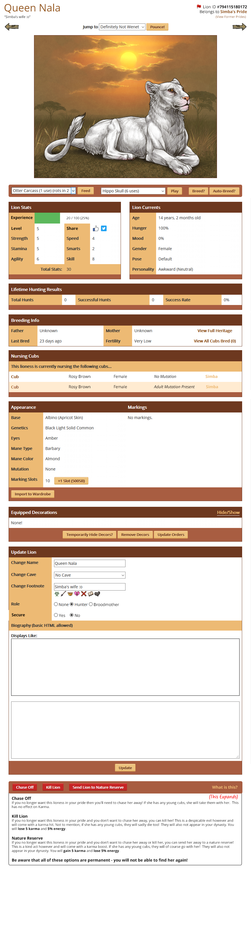
Hello everyone! Earlier in the year we discussed various convenience updates we wanted to make around the site. One of those included adjustments to the Lion Page to make it easier to feed, play and breed lions. I have come up with a preview of how we'd like to move things around to make them a bit easier, and we'd really like your opinions on whether anything could be more streamlined and easier to access. What are the most important things to you that you'd like to see implemented or changed? What other changes should we make? Link to Lion Page Mockup New position for social media buttons * This is a big file, I would advise not opening it using mobile data. |
 Report
|
Rikki (#47869)
Usual View Forum Posts Posted on 2018-08-03 05:47:58 |
|
flyteck [G2 Hibiscus Frail] (#40496) Good Natured View Forum Posts Posted on 2018-08-03 05:47:58 |
I don't like the location of the share button personally, but everything else looks good to me!  0 players like this post! Like? 0 players like this post! Like? |
|
Manti (#126171)
Total Chad View Forum Posts Posted on 2018-08-03 05:48:32 |
Love it, but I think the name, ID, and what pride it belongs to should stay centered <3 Overall it's nice, though. 0 players like this post! Like? |
|
Susurrus / G2 Ivory ESR (#118978) Bone Collector View Forum Posts Posted on 2018-08-03 05:49:08 |
|
SurfMutt (#1178)
Devastator View Forum Posts Posted on 2018-08-03 05:53:33 |
The only thing that has always really bugged me is having to scroll halfway down the page every time to interact, since I just play with all of my lions that way and spare the uses on items. If the interact button was somewhere close to the top (the one that gives the options of play, tussle, or groom) then I would 100% support! I LOVE how the name & info are separated out though at the top! I always thought it looked kind of jumbled all up there together! 0 players like this post! Like?Edited on 03/08/18 @ 05:58:17 by SurfMutt (#1178) |

|
Blue Pigeon 🐦 (#68580)
Warrior View Forum Posts Posted on 2018-08-03 05:58:16 |
The share button is quite jarring, but other than that I definitely prefer this layout over the current one. Maybe move the share button to the upper right corner of the Update lion/Biography section instead? 0 players like this post! Like? |
|
Abbey 💖 (#1)
Usual View Forum Posts Posted on 2018-08-03 05:58:31 |
I'm planning on merging the Play, Tussle and Groom options into the actual Amusement interaction, and if you have no Amusement items then those are the only three options that show up. Hoping to just condense things down a bit :) 0 players like this post! Like? |
|
Abbey 💖 (#1)
Usual View Forum Posts Posted on 2018-08-03 06:02:43 |
We would like the Share buttons to be reasonably prominent - I know generally they're ignored and can be annoying to some people, but when they are used they can drive traffic to the game. Putting them in the update section sort of hides the share buttons at the bottom of the page where nobody can see (and also hides them from view of people who don't own the lion). I'm currently thinking perhaps on the top of one of the bars, like so: http://prntscr.com/ke9esj 0 players like this post! Like?Edited on 03/08/18 @ 06:05:07 by Abbey 💖 (#1) |
|
Nunie (#144300)
Majestic View Forum Posts Posted on 2018-08-03 06:07:53 |
I love it! The top will take a little getting used to (the non centered name&info) but I can live with it, and I like the last screenshot where the share buttons are moved into a bar instead of awkwardly sitting in the other spot xD 0 players like this post! Like? |

|
flyteck [G2 Hibiscus Frail] (#40496) Good Natured View Forum Posts Posted on 2018-08-03 06:29:25 |
I much prefer them in the top bars. They just seem out of place next to the actual stats. 0 players like this post! Like? |
Myriad (#76)

View Forum Posts Posted on 2018-08-03 06:42:05 |
I really like it! It’s so much neater and more user-friendly :) I also agree the share button is better on the top like in your second example, it doesn’t look as out of place like that imo. Looking at it like this I actually would be tempted to rearrange the order of the tables so that Breeding Info, Lifetime Hunting Results and maybe even Nursing Cubs are all below Appearance. Just because I feel like Appearance is what most people are using/referring to more than the others. But that’s only a random thought, I don’t think it matters in the grand scheme of things. In terms of the interact (play tussle groom) being merged into the other play options (i.e. play using toys) I like that idea too. But I’d love if it was somehow the default or whatever, so you don’t end up needing to do a bunch of scrolling or changing things around in a dropdown to avoid wasting toys. I tend to only interact with all mine for the sake of saving amusement items for other things like the July cloud forest or crafting etc, and it’d be nice to keep it as just a quick and easy single click like it is now. Except better, without all the scrolling  0 players like this post! Like? 0 players like this post! Like? |

Blue [Full BO dawn] (#73123)

Holy View Forum Posts Posted on 2018-08-03 07:10:12 |
I do really like this a lot, but I'm not sure if I can give it a full support because of the chase, kill, send off buttons. They're a tiiiiny bit close to each other in this new mockup, so it would be easier to accidentally press one instead of the other, especially on mobile. It's not that huge of a deal, considering you wanted to get rid of them anyhow, but it may be obnoxious for people who are killing/sending off for karma, or people who value their energy a lot. I like how there's a clear distinction between each one as it is right now, but that's just me! What I do love about this is the EXP with the stats, and the interaction at the top of the page! *Especially* breeding, if you're spam breeding vlfs that's gonna be nice. Everything is organized and in a lot better positions that make a lot more sense. Easier setting of roles, better nursing cubs... Other than the small thing above, I really really do love this and feel like it's a lot more streamlined. 0 players like this post! Like? |

|
Abbey 💖 (#1)
Usual View Forum Posts Posted on 2018-08-03 08:14:10 |
I will definitely try to make sure the Chase/Kill/Nature Reserve buttons are a bit more spaced out than they currently are with mobile in mind! Thank you for the feedback :) 0 players like this post! Like? |
|
Kraft (#738)
Aztec Knight View Forum Posts Posted on 2018-08-03 23:41:37 |
imo the Appearance tab should appear over Lifetime Hunting Results. I feel Appearance is more important than Hunting, Lineage & Cubs. The way the EXP bar shows feels out of place graphically - unsure how to fix. 0 players like this post! Like? |

|
Ethereal Raptor 🌈🏳️⚧ (#144317)
Maneater View Forum Posts Posted on 2018-08-03 23:41:39 |
I agree that the name, ID, and what pride it belongs to should stay centered. Otherwise I love it! 0 players like this post! Like? |
Topic is locked
Memory Used: 631.55 KB - Queries: 0 - Query Time: 0.00000 - Total Time: 0.00382s