|
|
|
|---|---|
| Posted by | -LOCKED - OPINIONS: Lion Page Adjustments |
 🌈 Abbey (#1) 
Usual View Forum Posts  Posted on 2018-08-03 05:43:24 |
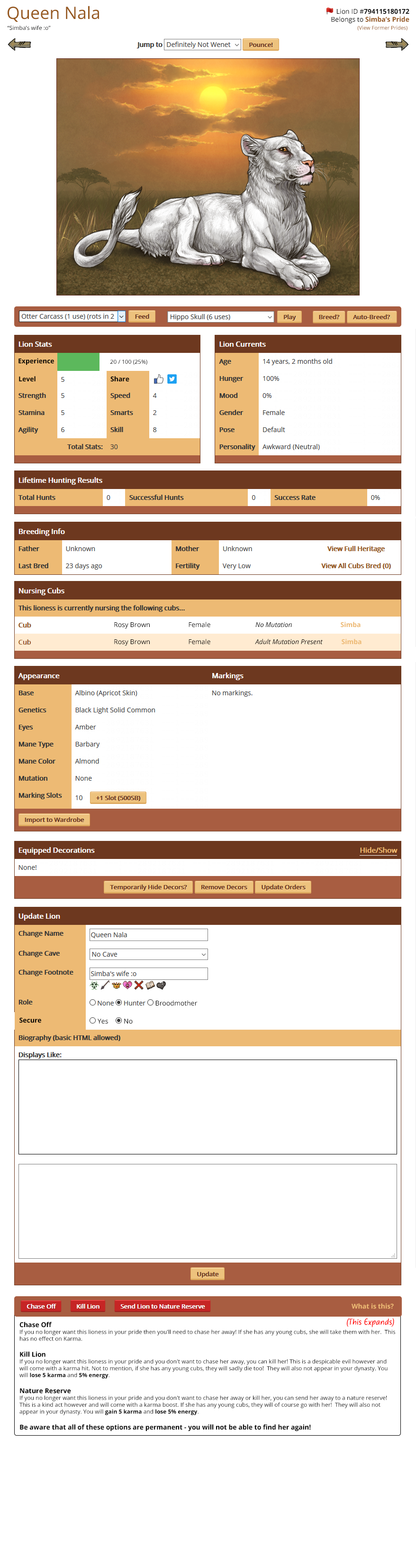
Hello everyone! Earlier in the year we discussed various convenience updates we wanted to make around the site. One of those included adjustments to the Lion Page to make it easier to feed, play and breed lions. I have come up with a preview of how we'd like to move things around to make them a bit easier, and we'd really like your opinions on whether anything could be more streamlined and easier to access. What are the most important things to you that you'd like to see implemented or changed? What other changes should we make? Link to Lion Page Mockup New position for social media buttons * This is a big file, I would advise not opening it using mobile data. |
 Report
|
solusfaust (#148949)
Heavenly View Forum Posts Posted on 2018-08-04 09:05:24 |
This is fantastic! One thing I would suggest is to make COLLAPSIBLE / EXPANDABLE as many parts as you can. For example, it'd be great to have the APPEARANCE tab and UPDATE LION/LIONESS tabs be collapsible, since both are so huge. I also strongly advocate to KEEP THE INTERACT BUTTON.  0 players like this post! Like? 0 players like this post! Like?Edited on 04/08/18 @ 10:06:50 by solusfaust (#148949) |
|
Jewel Wildmoon (#127341)
Deathlord of the Jungle View Forum Posts Posted on 2018-08-04 09:19:11 |
Ohhh I support this! Only one concern I have though. If the kill, chase and reserve buttons are so close together, people might end up accidentally clicking the wrong one. Things like that normally happen to me if I play on Puffin Browser since the screen glitches as I click and ends up selecting something completely opposite of what I wanted to click ;u; 0 players like this post! Like? |

Princess (#85715)

Incredible View Forum Posts Posted on 2018-08-04 09:25:44 |
I definitely agree with everyone who wishes for the lion name, ID, etc (all the info at the top) to stay centered. Personally I think the page order should go like this: Top Info [name, ID, pride, etc] Lion Image Feed, Play, Breed Buttons Expandable Bio Lion Stats & Lion Currents [I like the share buttons in the brown top bar best but idk what it would look like with that empty space in stats next to level] Appearance Breeding Info Nursing Cubs Lifetime Hunting Results Equipped Decor Update Lion [Make Expandable] Chase, Kill, Nature Reserve Thanks so much for all your hard work!! 0 players like this post! Like? |
|
Shetani (#29416)
Sapphic View Forum Posts Posted on 2018-08-04 09:50:07 |
I strongly dislike the removal of the Interact button. I never use amusement items on my pride members, as I need them for crafting. If I were forced to scroll down a huge list of every toy in my hoard just to get to the play/tussle/groom options, it would take way longer to care for my pride on a daily basis and severely impact my play experience. The second social media position, next to the Lion Stats total instead of embedded into the stats themselves, is much better. As mentioned, the chase/kill/reserve buttons are a bit fiddly in the current mock-up, particularly because they are all so close to each other and one is bigger than the rest. You might also consider changing the colors of the buttons (yellow/red/green, perhaps?) to distinguish them a little more. Everything else looks great! 0 players like this post! Like?Edited on 04/08/18 @ 09:52:36 by Shetani (#29416) |
|
betadolle [clean murk] (#138632) Deathlord of the Jungle View Forum Posts Posted on 2018-08-04 10:00:08 |
LIKES: - I like the flag button next to the Lion ID; it saves room and makes it clear where one should click to flag a lion. - I love how the Feed/Play/Breed buttons are just under the lion image. That would make caring for them so much easier and saves room on the page (less scrolling). - Putting the experience bar in the same box as Lion Stats makes a lot of sense and saves room. - Including the nursing cubs' base, sex, mutation, and father would be super helpful for keeping track of which cub is which while they're being nursed, without having to look at the cub's own page and scroll around. - Being able to make a lioness a broodmother in the same way we make her a hunter would make things *so* much easier and save room on the page; being able to secure a lion in the same box would prevent accidental securing or un-securing. - Chase Off/Kill/Nature Preserve options being on the bottom, with the buttons at the top and descriptions underneath, looks like it would help with accidental clicks! (As they are now, if you scroll too far, you can accidentally kill a lion you want to chase or something - if the buttons are next to each other instead of on top of each other, this is more easily prevented). CRITIQUES: - The name, footnote, ID, and pride should still be centered on the page; in the example, it looks like Queen Nala's name is "Definitely Not Wenet." - The lion's level should be made distinct from the stats in some way, perhaps by bolding, so it's easier to find. - The auto-breed button should still have the cost of auto-breeding listed. - The share button is totally out of place in the stats box in the main example, but looks more appropriate in the newer example. Overall I think the design is really good and streamlined! 0 players like this post! Like?Edited on 04/08/18 @ 10:05:11 by au-species (#138632) |
cake 💫 (#53239)

Wastelander View Forum Posts Posted on 2018-08-04 10:08:57 |
I don't know if anyone else has pointed this out bc I'm too lazy to read all the comments but-- Just underneath the lion info where it has [item] Feed, [item] Play, Breed and Auto-Breed... where is the Play/Tussle/Groom option? Could that be squeezed in anywhere? I'm going over it several times to make sure it isn't just a case of "Cake your eyes are complete Garbage™" but I can't see that option anywhere  0 players like this post! Like? 0 players like this post! Like? |

|
banooky (#61625)
Heavenly View Forum Posts Posted on 2018-08-04 10:11:21 |

|
Lady Argent (Clean/StM) (#146403)
Resurgent View Forum Posts Posted on 2018-08-04 10:12:02 |
Besides agreeing with people that the ID and name and pride should be centered (the extra long open space looks...really awkward), I think I gotta also agree that the boxes could use some rearrangement. Breeding/interacting should definitely be where they are in the mock-up, and I'm happy to have the EXP Bar up there with stats, too. But after that order (top info > Image > Interact > Stats/Currents) I think things get a bit messy. Having the "Update Lion" stuff so far down is a serious hassle to get to, for something we're all going to touch a lot (removing a broodmother, adding a huntress, etc). So, my revised order after Stats/Currents would be this: Appearance (Collapsible, perhaps a toggle in your den, like for decor?) Heritage/Breeding Info (useful for clean breeders and stat breeders especially) (Broodmother Box?) Nursing Cubs (Broodmother Box?) Update Lion (I liked the suggestion this too be collapsible, because it is also huge) Equipped Decor Hunting Results Reserve/Chase/Kill Lion This just seems really logical to me, a progression of how often a box is used combined with trying to make it look neat and orderly. Since visitors to a lion's page don't see the Update Lion box at all, it would only affect the owner's view: and personally, scrolling through the other boxes to reach it at the bottom is very frustrating. And I really like the idea of making both of the biggest boxes (Appearance and Update) collapsible via toggle in your den, just like Equipped Decor is now. It would streamline a page without making it inaccessible if you need to get to it. I also liked the suggestion to change the colors of the Reserve/Chase/Kill buttons, and keeping the item-less amusement button separate somehow. But in general I LOVE the new way it's set up, I just think some things need to be shuffled. The change in the Update Lion box is amazing to be honest. Is there any way we could get a look at what the broodmother box would look like if we assign a girl as a broodmother? Or any info on what happens if we change her to none after she's a broodmother? I would like the broodmother box placed Above or Below Nursing Cubs, in my list or yours, but with the new layout, maybe it is supposed to go in a way I'm not thinking of! 0 players like this post! Like? |
|
Wendigo Psychosis (#68128)
Notable Lion View Forum Posts Posted on 2018-08-04 10:42:31 |
Hmm, I agree with what someone said previously that the lion's description is kind of buried, but honestly there's nowhere else to really put it. At the very least maybe put the 'Displays Like' box above the box used to actually edit the lion's details. That way when you're looking at your own lions you first see the biography as everyone else would and the box to edit the details would be secondary. Also it would be nice if the actual display box expanded vertically to the size of the text so you don't have to scroll through it. That way it would feel less hidden. Other than that, I agree with reordering the boxes a bit (appearance higher, decor under biography), keeping the name centered, the second placement of the share options, spacing out the chase, kill, and reserve buttons, and having play/tussle/groom be the default first option before using toys. (Honestly, maybe even condense it to just 'play' or even 'interact' or something, because who even scrolls through to pick a specific interaction everyday on every lion?) Here's My Mockup Edit: I think I realized what looks wrong about the experience to me (and possibly other people). There's nothing defining the bottom of it. Which is fine where it's filled in, but where it's white it kind of merges with the stat area below it. So maybe just put a thin line along the bottom of the xp bar. 0 players like this post! Like?Edited on 04/08/18 @ 11:05:33 by Wendigo Psychosis (#68128) |
|
Dearel (Clean) (#44102)
Dreamboat of Ladies View Forum Posts Posted on 2018-08-04 10:58:03 |
I like the idea of moving the interact button to the top with the feed button. However, I'd rather not have the default be toys first. I like to use Play/Tussle/Groom first then use toys if needed to fill in the gaps. If you took Play/Tussle/Groom away if toys are present, then I'd have to hoard all my toys every day, then unhoard them to use them. =( Also, second suggesting keeping the Chase/Kill/Nature Reserve buttons separated a bit more. Just so no sad accidental clicking. We're also keeping the Secure button right? XD I don't see it there, but I really like knowing my lionesses are secured from being accidentally chased off. 0 players like this post! Like? |
|
Willow, The Lethal Collector (#138477) Holy View Forum Posts Posted on 2018-08-04 12:46:50 |
|
Crow (#112292)
King of the Jungle View Forum Posts Posted on 2018-08-04 12:50:15 |
Did anyone else noticed that the lioness has the default appearance from when you go into the wardrobe? I like how this design takes up less space. I think the breeding button should be by the rest of the breeding information, but I like the condensed version of the chase/kill/reserve functions. I sometimes secure my lions just to eliminate those extra boxes. 0 players like this post! Like? |
|
Bandersnatch (#118925)
Heavenly View Forum Posts Posted on 2018-08-04 13:52:37 |
Personally I love, it’ll take some getting used to but that’s fine. I agree with everyone about the IDs looking strange so far apart lol and I quite like wendigos mock up, with the name centred and the slight rearrangement of boxes 0 players like this post! Like? |

|
Alabai (#28971)
Impeccable View Forum Posts Posted on 2018-08-04 15:56:36 |
I love the mockup page! I think everyone has commented already about spacing the chase/kill/reserve buttons in case of "oops!" finger-mashing mistakes. ;) That seems WISE... hahahah I am concerned about the missing "interact" (groom/tussle/play) because I already PAY for the "feed all play all" and it DOESN'T... it's broken, and the adols get IGNORED, which means I keep getting players mad at me when they buy an adol I didn't play with because I /forgot/ to use that button... and it runs away... if it isn't there, to be able to do that, i'd have to use toys, and that's even MORE irritating, since I already PAY for feed-all-play-all. If that's fixed, then it's a totally fair choice for staff to make, assuming that's the actual plan, of course, and not an oversight oops. I understand some players like to leave the adols hungry/sad to "conserve"... but that's a game choice. I pay for Feed-all-play-all in ORDER to feed-all-play-all... and I would be really frustrated by having the whole thing even further botched up- so I'd ask that if you remove interactions, you ALSO fix the feed-all-play-all (that pay for) option(s)... I'm totally OK with needing to pay for this option or using actual toys, tho! 0 players like this post! Like? |
|
Liosmirk ⛈ (Clean) 🍂 (#127804)
Resurgent View Forum Posts Posted on 2018-08-04 16:18:18 |
Where is the experience bar and the button for levelling up the lion going to be? Is it under the "Lifetime Hunting Results"? Because that's not too bad for having to scroll and hit a button to level up. 0 players like this post! Like? |

Topic is locked
Memory Used: 649.34 KB - Queries: 0 - Query Time: 0.00000 - Total Time: 0.00488s