|
1 |
|
|---|---|
| Posted by | Custom Decor Info and Links |
 ★Rascal4488★[G1 Ennedi] (#34765) 
Sapphic View Forum Posts  Posted on 2025-03-04 22:21:24 |
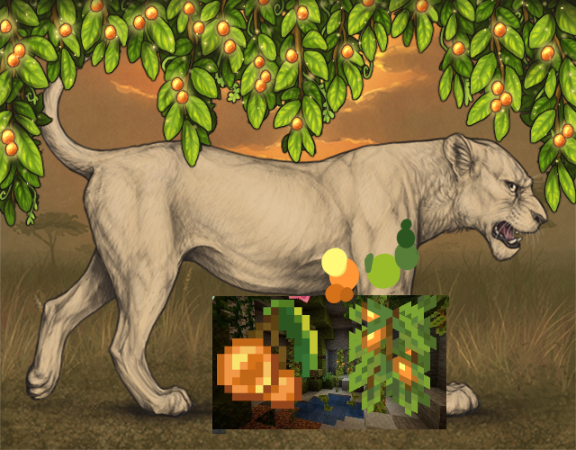
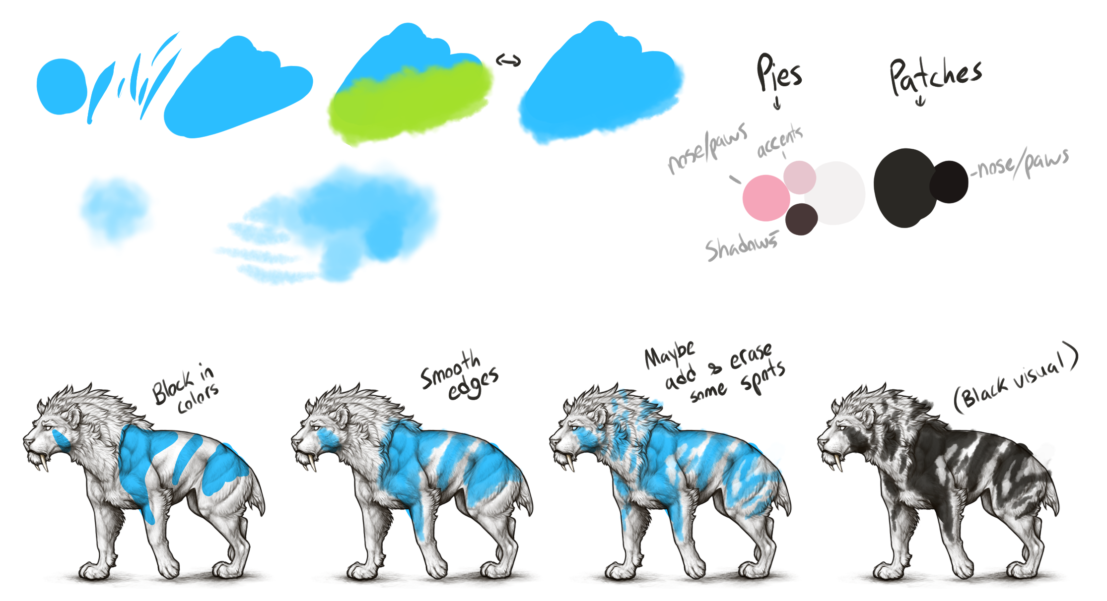
Welcome!This page aims to help give new Custom Decor artists helpful links, resources, and some general tips all in one location. It itself is not a guide into starting Custom Decor, but will hopefully help you start out all the same! Main Resources and LinksHandy-dandy links and plus a summary for each resource and why you might want to check it out! [Custom Decor Rules] This is an Official Post featuring all the custom decor and beetle skin creation rules. A general understanding and knowledge of the rules will help a lot for both creation and submission, but you don’t need to worry about memorizing the rules as you can always reference this if you're unsure. [Art Style Guides- One and Two] These are both Official Posts by Xylax that include; How to match his style, PDS files for making decor, and even his personal brushes! That first link will actually take you to Wolvden (no account needed to read the link), it covers all the same things but is a more recent post and I feel like does a better job explaining his process. I also linked the Lioden post though, because despite older information this is where you can download the official linearts and his brushes. [Additional Linearts] The official linearts are flattened images of both the lineart and a base colour underneath, meaning it’s not possible to draw or colour underneath the lineart itself. This player fixes that issue and has linearts, without the base colour, separated and ready to download. An example why you might need this is if you wanted to make a Bodypaint decor that retains the appearance of the lineart (i.e. clipping lineart layers to preserve shading continuity). Or even to just make some new base or marking designs to share. If for some reason these don't work for you, you can google how to separate the lineart from colour for your art program, such as using "Convert Brightness to Opacity" or similar actions. -Credit to Lucas (#229229) [Linearts if PSDs Don’t Work] In case you use an art program that doesn't work with PSD/photoshop files, this player has compiled most of the main linearts that will work in other programs. -Credit to Allycat (#142402) [Making & Submitting Decors] This is a fantastic guide for getting you started in both making custom decor and teaching you how to submit it! While the majority of the guide is focused for new decor creators, it also has some post-approval information like how to edit approved decors. -Credit to freya (#180839) General TipsInformation or tips that are handy to know! ➤ Imugur doesn’t work for Custom Decor. It hasn’t for a few years now, so you'll need to use another site for your CD. The devs now recommend FreeImage so prioritize using that, but here are two others that will still sometimes work: ImgBB and PostImages The reason is do to an ongoing issue, if you want to learn a little bit more it was touched on in Community Update 252! ➤ Approval wait time Varies The quickest I had was a decor approved same-day, and the longest was almost two weeks. Expect the time between approval decors to vary from decor-to-decor, and probably even person-to-person. In my experience effects like glowing parts, fire, lightning, halos, etc, all get approved fairly quick but larger and more detailed decors (especially Jellyfish decors) take longer to go through. Be patient! ➤ Custom Decor has a 3gb ‘tax’ for Buyers This will be mentioned in some of the links, but Custom decor has a 3gb 'fee' or 'tax' that it takes from the buyer… which is also why custom decors are more expensive to buy! If I went to sell a decor for 1gb, buyers would need to spend 4gb. I would get my 1gb, and then the 3gb just gets deleted/voided. Accidental purchases or even change of mind can happen so If someone asks for a refund it's good to explain why you can only give them a partial refund (the tax mentioned above), because many don't know that the artist doesn't get full earnings. I personally give the refund that I can, and then let the buyer keep the item anyway (if they want it) as compensation for the 3gb they can’t get back. I don’t need the copy back, it didn’t come from my gb, and a little kindness goes a long way! ➤ There are Character Limits in Creation Most of the time you shouldn’t need to worry about the number of characters in the name or text of your decor, but it’s still good to know that there is a limit. You can use a max of 35 characters for the name of your decor, and a max of 100 characters for the summary of your decor. Characters being essentially anything a keyboard (letters, numbers, symbols, spaces, etc.). If you’re worried about your number of characters, you can always check a Word Counter that includes characters in its count. ➤ Work in Double-Size if possible If you use a program that can increase & decrease the size of the canvas cleanly (e.i. It doesn't affect the quality of your art), then 100% do it. Lioden image size is 640 width by 500 height (pixels). This lets you get in extra details without doing pixelwork, and is how Xylax seems to work as well. I mostly work in double size and size down for posting, but I make expectations for smaller decor, like earrings, where it’s both easier to just work in the smaller size and it keeps the quality cleaner. I use clip studio paint, so for me it's just going to Edit -> and clicking Change Image Resolution, which will adjust the entire canvas. Most art programs will have the feature in a similar area. ➤ Reference, Reference, Reference As an artist, you’re probably already familiar with being suggested to use references. Getting started into custom decor though, I feel it’s both good to reference what you’re aiming to make along with looking at the game’s artwork. My favorite resource is simply the Lioden Wiki’s decor page. It lists every decor in the game, with icon visuals, and categorizes it wonderfully. From there I can find which decors I might want to look at for style matching, and I can search them in the wardrobe for a better look. It’s helpful seeing how Xylax and the team draws flowers for the site before just jumping in and drawing flower-decor. ➤ Make Decor for fun, not profit. I’d be lying if I said my decor wasn't making profit for me now, but it also took me 10+ decors before I was getting 'regular' income. That’s a minimum of 100gb, because the creation item is 10gb, and by ‘regular’ income I might get a sale a day. On top of that, the decors I’ve spent the most work on are my least popular. This has never bothered me because I’ve always chosen to make custom decors for fun- in fact the second I’d break even on a decor I’d just go and buy another creation item! But if I was seeking profit, I’m not sure I would have gotten as far as I have now. ➤ Expect needing to fix your Work Simply put, be prepared to do a bunch of fixes on your first few decors. It took me a lot of custom decors to finally get somewhere where I didn't need to do any fixes- and I still need to do adjustments from time to time. Starting out however, I went in blazing and expected it to be approved first-time-threw… it didn’t happen, and even after my first round of fixes I had more to do. If you go in being prepared to do a bunch of fixes for your first few decors I think you'll have a better time than I did starting out haha. ➤ You can PM Xylax for Questions First and foremost, ask other players and search on the forums if you have questions! Essentially, got to him as a last-resort, but if you can’t find your answer Xylax will answer Custom Decor related questions! His replies will also take time, as he is busy and probably still gets plenty of questions. I’ve sent questions to him in the past to get further details about the “No Copyright” rule to make sure my tribute decor didn’t ‘fly too close to the sun’. Here are the questions and responses!: ● Would a Stardrop from Stardew valley, or Illidan's horns from World of Warcraft still fall under the copyright rule for Custom Decor creation? "Hi! Horns are more vague - you just have to avoid making them identical in this context, or their name should not have copyrighted words that can put them into legal question (such as Illidan, or Death Knight + The Scourge, etc). I'm not sure about Stardrop, that's a very specific object. Depends how your take on that would look, and what other name you would give it - tributes are fine, we just cannot risk violating copyrights.” ● I am doing a tribute decor for Minecraft (Glow Berries). I made the berries large and ball-like, similar to the original item, but in doing so now I'm not sure if it is too close to the original or not. Is this okay (copy-write wise) or does it need to change/ deviate more? Tribute Decor WIP Picture *The finished decor was approved, and can be found here. “Aw that is very cool! Maybe make sure the name is a bit changed just in case” ➤ Making Fake Piebalds and Patches! First and foremost it's good to mention that Pies and Patches for default lions are not allowed- as these are already supplied by the game official mutations however fake pies are allowed for mutations. They need to closely resemble official pies/patches, included Piebalds needing to have pink skins and a gentle yellow/pink hue. Pies are a great starter decor- they're fairly straight forward, you don't need to shade or line anything, and they sell fairly well! Xylax's brush set has brushes for pies, but I prefer using a Cloud brush! Any non-stamp cloud brush should work fine! If there is large patches of colour, I use a basic flat brush and then smooth out the edges with the cloud brush, but sometimes I'll just paint solely with the cloud brush. Here is a rough example for my process along with my palette I use for my pies and patches- feel free to use those palettes, that's why I've included them! This was done very quickly for examples, but gives a basic idea on how I use my cloud brush for pies! ➤ What does “Too sharp and pixelated” mean? This is the number 1 most common issue when trying to get CD approved! In short, when the mods say something looks too pixely and sharp it means your artwork (normally lineart) looks too similar to pixel-art they want you to soften the lines more- so it needs to be more blurry. But to be more descriptive and exact I’m going to go in depth here! !!! And as a fair warning, because this is so common and sometimes quite the hurdle, this will be a lengthy section describing the issue plus possible causes, and offering solutions that have worked for me with pictures included! Here is the PICTURE GUIDE to go along with this. Warning; it's big and you might need to load the full resolution. Feel free to look at it now or have it open in a tab what you’re reading so you can reference the pictures! Part1: What is too pixely and how can we try to prevent it? When I first got hit with this issue it was super confusing to me because I associated ‘pixely’ with blurry- if something was really blurry it was pixelated. Only after trial and error did I realize they want it to look less like pixel-art and less crisp, and in fact a bit of blur was good! Their lineart is pretty blurry and soft if you zoom in, with some sections even hard to see the actual pixels of the lineart. I’ve added visuals comparing my standard brush to a 0 anti-aliasing brush/pixel art brush to help emphasize this. To me the clearest difference is how the brush strokes start and end; The standard brush has a soft blurred end while the pixel brush has a sharp and pixel-perfect tip. It’s best to use softer brushes when it comes to your lineart, but even if your lineart is more pixely, a little blur might be all you need to fix your issue. If you work in double-size, make sure to check what shrinking method you’re using- it might be the culprit to your pixelation! Normally this is found in the same section/pop up menu as where you would change your image resolution. Xylax uses and recommends “Clear Edges (bicubic)” but I find “Smooth Edges (bilinear)” works best for my program. To figure out what works and looks best for your program, first make sure you save pre-hand (or save a copy- this is just a safety precaution for messing around), then shrink your image with one of the selections and see how it looks! Undo it/ reload your save and try the next one. I took screenshots too just to visually compare next to one another, but it’s as easy as that! Part2: Okay, but how can we fix the issue? First off though if I was originally working double size and my decor was rejected for being too sharp/pixely, then I choose to do my edits in posting size/small! I’ve stayed working in double size before, ‘fixed’ the issue, and still had the problem flag again because shrinking part of the problem (and I didn’t realize at the time) so now I just do any touch ups in the small size! Working in big and doing small edits/tweaks in small simply has had the most success for me. Also, I talk about my picture examples for this part at the bottom. Now onto the work-arounds! 1) If the mods mention a particular problem area, such as the fur on a part of the decor, then I'll lightly go over/trace over the lineart with a soft brush (on a layer above, normally) to help 'smooth out' the problem lines. 2) If the whole lineart is a problem, then I like to duplicate my lineart and softly blur the lines. Sometimes I will only keep the slightly blurred version visible, and other times I like to keep both non-altered lineart and the edited lineart visible (maybe tweaking opacity of one/both as needed or to preference). 3) Lastly, a couple times I was particularly struggling, I simply made my lineart thicker by tracing/drawing on top of the lineart with a very soft brush/airbrush, like method 1 but I also deliberately trying to thicken the lineart. Not my preferred method, but it’s gotten the job done in the past and kept me from properly redoing the entire lineart. In my picture examples, the first set was declined because some areas of the fur were too pixelated, and it wasn’t a problem with the entire Cloak! After assessing what looked like the more pixel-arty sections I drew on top of the lineart (method 1) but then also opted to thicken up the lineart a bit to match the official lines more (personal choice). The second set I was trying to match the old Leopon artwork and ended up having lines that were both a bit pixely, but more notably started the lines to blend into the background a bit. In this case I also used method 1 but also made sure that my lines appeared more solid/dark. The last set wasn't actually rejected, and instead I noticed a few areas that I worried would get dinged so I opted to do some touch-ups before finally posting. So you’re seeing some pre-submission touch ups! Still using method 1 here, and just targeting areas that I felt might be an issue. White decor is easier to see the pixelation on so if you’re working on a decor and worried about pixelation, check how it looks in White! I’ve had a Black mane submitted and get approved but then my second White version got rejected and needed fixing for pixely and sharp; The only difference was the colour, but the Black mane hid a lot of the pixelation. I always submit my White decors first now too- if my white decor can pass, then any other colour variants will too. For the record too, this decor ended up getting approved no errors, so I suspect my touch-ups were a good call (but we'll never know for sure)! There won’t be one-right way to fix the ‘too pixelated’ issue, so do whatever works for you including trying your own method! *The CD used for these examples; Pale Rabbit Cloak [Ennedi] Serpent Tongue [Leopon] White Primal Mane [Ennedi] Info About MeHey you made it! Finalllyyy! Good job. Feel free to not read this part, it’s just a quick rundown about me and my experience with Custom Decor. ✦ I have a lot of Custom Decor. I've made over 100 custom decors at the time of making this and I don’t plan to stop. Throughout my time making Custom Decor I’d often give out tips and links to anyone looking for help getting started which overtime became quite the large resource kit. I lost count how many times I’ve sent out this ‘Custom Decor Starter Kit’ as I’d call it, and I figured it was time to make it into a public forum for anyone to find and share. All the tips above are just from personal experience and my own learning overtime, though I welcome others to leave their own tips below too! Genuinely, I simply enjoy trying to match the site’s style and work with the constraints given. Making custom decor for me is both fun and challenging! If you’ve gotten this far- I want to wish you the best of luck with your custom decor journey. Feel free to leave questions for myself and others to answer!  16 players like this post! Like? 16 players like this post! Like? Edited on 01/05/25 @ 13:07:59 by ★Rascal4488★[G1 Ennedi] (#34765) |
 Report
|
BonesAndSpices (#496063)
View Forum Posts Posted on 2025-03-29 11:26:42 |
Thanks for the guide! This is really helpful! I also using Clip studio Paint but can't quite find the perfect brush sets for as sample outlines and so on, may I ask which brush or sets you work with? And which dpi size? Thanks in advance! 1 player likes this post! Like? |

|
★Rascal4488★[G1 Ennedi] (#34765)
Sapphic View Forum Posts Posted on 2025-03-29 12:11:18 |
@BonesAndSpices Happy to help! First thing- I'd recommend Downloading Xylax's brushes actually! They're photoshop brushes but Clip can register them still (just manually). Downloading the brushes, and then drag and dropping the brush file(s) directly to the brushes in clip. I'm not always the best at explaining- so you might need to google how to download photoshop brushes with clip, but I assure you it's very easy and then you can have all of Xy's own brushes at your fingertips!  _______ As for what I use, it's a mix of my own brushes, clip's basic brushes, and Xylax's brushes. I rename a lot of my brushes so I'll do my best to describe what I'm using. I use a Standard Pen brush for the linearts and sketches with max anti-aliasing around the brush so there's very few pixels and it smooths it out nicely. Brush size 7, only 10 stabilization. No texture or anything, and very standard brush shape making a thin line with two pointed ends. I prefer the less stabilization for smaller decor and parts I want to look more organic or messy like manes for example! I also have a copy of this brush with very high stabilization (80-100, I tweak it time to time) for decor that I want long perfect line strokes with, like the brim of a hat, or long drapery jewellery. Then my other main brush I used is a tailored/edited brush for shading, it's essentially an edited oil paint brush. If I press hard then the paint has high opacity and strong lines, if I press light it has a very low opacity and slightly smudges/blurs already placed colours. No stabilization, no texture, standard brush shape, preferring 7 for size again! As for my other brushes, they're mostly standard brushes (sometimes tweaked slightly to my preferences) and Xylax's. I have a Flat colour brush that it just a big flat high-opacity brush I use for slapping down base colours, a Soft airbrush that I use time to time like adding gradients, additional soft shadows, softly erasing something, etc, Xylax's fur brush for mane and fur texturing, and a cloud brush for piebalds/patches. Anything else I feel like I need I just look through my current brushes, Xy's or just the clip assets store - so if something calls for speckles, or more texture, I just kinda shift around and see what I have or need. 0 players like this post! Like? |
|
BonesAndSpices (#496063)
View Forum Posts Posted on 2025-03-29 12:18:41 |
Oh didn't knew that I will definetly look into it and add the brushes! and thank you so much for the information this will help me alot! :D  1 player likes this post! Like? 1 player likes this post! Like? |
|
★Rascal4488★[G1 Ennedi] (#34765)
Sapphic View Forum Posts Posted on 2025-04-16 11:12:57 |
✦New! I have added another section at the bottom of tips for my general process in creating Pies and Patches decor. Picture example included (albeit, it's a bit messy).  0 players like this post! Like? 0 players like this post! Like? |
|
★Rascal4488★[G1 Ennedi] (#34765)
Sapphic View Forum Posts Posted on 2025-05-01 13:11:23 |
✦New! Huge Update today, I added a whole mini-guide within this sucker covering “Too sharp and pixelated”, the number 1 issue/ reason for rejected decor! The picture guide included with it is a bit of a beast, but I needed larger so you can visually see the pixels best. 1 player likes this post! Like? |
1 |
|---|
Memory Used: 663.73 KB - Queries: 3 - Query Time: 0.00094 - Total Time: 0.00507s