|
|
|
|---|---|
| Posted by | -LOCKED - OPINIONS: Lion Page Adjustments |
 🌈 Abbey (#1) 
Usual View Forum Posts  Posted on 2018-08-03 05:43:24 |
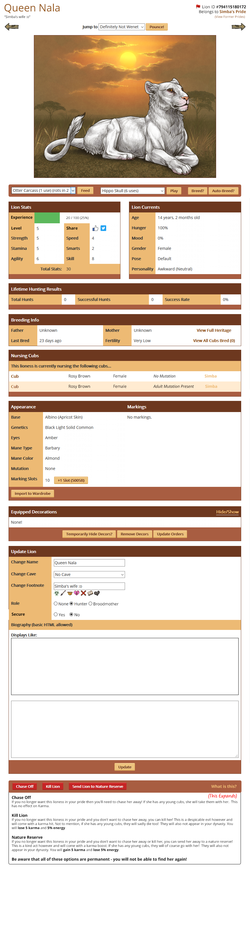
Hello everyone! Earlier in the year we discussed various convenience updates we wanted to make around the site. One of those included adjustments to the Lion Page to make it easier to feed, play and breed lions. I have come up with a preview of how we'd like to move things around to make them a bit easier, and we'd really like your opinions on whether anything could be more streamlined and easier to access. What are the most important things to you that you'd like to see implemented or changed? What other changes should we make? Link to Lion Page Mockup New position for social media buttons * This is a big file, I would advise not opening it using mobile data. |
 Report
🐝 Detective (#19805)

Protector View Forum Posts Posted on 2018-08-03 23:42:05 |
I personally preferred the Centered look to the lion's name and ID. Having the "Jump to" the focus right off the bat is a bit of a deterrent. But otherwise, I am enjoying the changes.  0 players like this post! Like? 0 players like this post! Like? |

Xathina[main] (#70238)

Epic Fail View Forum Posts Posted on 2018-08-03 23:43:45 |
since i didnt see it on there (maybe im just not observant or perhaps its actually not) i would love to have the retire lion option alongside the kill/reserve/chase i think it would be neat and tidy looking imo (edit: and like others have said, i also like the name/id/pride info centered. very soothing to my OCD) 0 players like this post! Like?Edited on 03/08/18 @ 23:47:18 by Xathina[main]#teamSeth (#70238) |

|
JaxHammer [Retiring] (#103364)
Sinister View Forum Posts Posted on 2018-08-03 23:44:58 |
I like everything except the kill/chase/reserve update. That's a bunch of muscle memory I'll have to re-learn if it gets changed. 0 players like this post! Like? |
|
Mad Hyena (#29080)
Special Snowflake View Forum Posts Posted on 2018-08-03 23:56:02 |
Im not sure how fitting my suggestion is, BUT Id really want it for the description of the lion be displayed ABOVE the image (for example between the Jump to line and the image), not somewhere looooow below, and be more like den description - on a white field, without a box, etc! That is the reason why I dont even put much descriptions on my lions, because with all the way to scroll down nobody would read their story + the current window it's strictly limited to cut down most of the text, which also lowers down the chances it would be read. If it was like in den description - a plain text without a box displayed between the Jump to line and lion image - it'd work so much more neat for putting stories on your lions. 0 players like this post! Like?Edited on 03/08/18 @ 23:58:58 by Mad Hyena (#29080) |

|
🐝 Detective (#19805)
Protector View Forum Posts Posted on 2018-08-03 23:59:20 |
No offense, but people go to lion pages to look at the lion not see a description right off the bat. I'd be annoyed going through trades looking for a lion to buy, and having the description above the image :X 0 players like this post! Like? |
|
🔥Envis🔥 (#74941)
Ruthless View Forum Posts Posted on 2018-08-04 00:02:32 |
I really like the mock-up as it is presented. The name and ID on different sides would take a little getting used to, but the "jump to" still has the name right in the center so technically it's not like you're gonna miss it. Also I love that it would tell you the name of the cubs father if they're still nursing, this would be useful as well to those who had double uterus lionesses so they know which king passed on/produced a mutation or special base without having to go to each cub's individual page. Personally I always lose track. XD I also like that the Broodmother option is beside the hunter option, that's been nagging at my OCD for quite some time. Having secure in that area instead of so close to the chase/kill/send is nice, at least I think so. I know a pop-up window comes up for all those options and you're reminded of what you're doing but still, ticking it off like that would be much easier. Also hooray for the breed button being at the top! Please keep that because omg the times I've forgotten my lionesses are in heat because that button is hidden is ridiculous. lol It's so hidden currently. I am totally for this being the new lion page! No problems here!  0 players like this post! Like? 0 players like this post! Like? |
|
[♰] Yharnam (#112370)
Holy View Forum Posts Posted on 2018-08-04 00:05:28 |
The secondary position for the share button is much, much nicer. I like screenshotting my stats for record keeping and how tidy it is now is pretty nice. Dunno why the share button would be included in the actual bulk of the stats. Over all, having the important buttons at the top would be super nice. At this point I'm only using the auto-breed feature cuz I get sick of scrolling down. 0 players like this post! Like? |

|
Mad Hyena (#29080)
Special Snowflake View Forum Posts Posted on 2018-08-04 00:06:22 |
Detective, lions for sale however dont really HAVE descriptions? (at least I dont really know anyone who puts stories on their for sale cubs....) Unless they're useful information included there like a link to adult Wardrobe preview etc? And that would be comfortable to have on top as well because it's a relevant sale information. It's just the current "Description" of the lion with it's current location and box, doesnt event feel like Description but more like personal notes of a user for that lion - lost somewhere down beneath where nobody reads it.(( 0 players like this post! Like?Edited on 04/08/18 @ 00:14:49 by Mad Hyena (#29080) |
|
[♰] Yharnam (#112370)
Holy View Forum Posts Posted on 2018-08-04 00:08:22 |
Didn't notice the non-centered names actually, oof. Is there any way y'all would consider leaving those centered, Abbey? I honestly think it looks a lot nicer centered, and makes for nicer screenshots that include picture and name. EDIT: The Kill/Chase/Reserve buttons I feel should be spread out more - evenly along that bar would be good - to prevent accidentally clicking the wrong one, especially for mobile users. 0 players like this post! Like?Edited on 04/08/18 @ 00:13:19 by -:[ ʙᴇɴɴᴇᴛᴛ ]:- (#112370) |
|
CALA (#105146)
View Forum Posts Posted on 2018-08-04 01:01:05 |
I made visual adjustments to how I personally would feel most comfortable for this current layout idea to look, you can view those here. Basically, I centered the name and adjusted position of the ID number and former pride text, and moved the wardrobe decor arrangement slot to be placed between the update lion section and the chase/kill buttons (which I also centered, to be in line with everything else I had adjusted on the page). I also moved the lifetime hunting bar to take lower priority beneath the appearance bar, as I feel like within the game there is far more emphasis based on looks an appearance than actual performance when it comes to the lionesses, so felt like that information would be better suited to a higher priority position on the page. These are just my ideas; I personally like the page the way it is without any alterations. I think altering the 'caring for' section would be beneficial, but I'm not a huge fan of the bar at the top beneath the lion image if I'm being completely honest - but in saying that, it seems the least obstructive way to go, therefore I haven't changed it in my own 'mock-up' edit. 0 players like this post! Like? |

|
Kit in a Box ~⚙️~ (#61637) View Forum Posts Posted on 2018-08-04 01:54:30 |
I'd prefer the name and foot note to be centered, but other than that, the mock up looks fine to me. ♥ 0 players like this post! Like?Edited on 04/08/18 @ 01:57:37 by Kit ~Ebony Addict~ (#61637) |

|
Papermonkey (#42914)
King of the Jungle View Forum Posts Posted on 2018-08-04 02:07:14 |
I too would like the name centered, and if possible, also the play/groom/tussle button that doesn't consume an item. I'm kind of a hoarder, and scrolling for a usable item among a thousand other items on every lioness I want to interact with daily feels a bit like a hussle. Otherwise I love this very much! Having the interaction and breeding buttons right at the top of the lion info is the best and I love it. 0 players like this post! Like? |
|
FoggyDownpour (#149684)
Unholy View Forum Posts Posted on 2018-08-04 02:26:51 |
I definately support! The only thing that I don't like about it is how close the kill, chase, and reserve buttons are to each other, it seems like it would be very very easy to pick the wrong button if you weren't paying enough attention 0 players like this post! Like? |
|
pearl_fox (#138494)
Amorous View Forum Posts Posted on 2018-08-04 03:26:21 |
|
Kripke ICE {Weekly Raffles} (#49153) King of the Jungle View Forum Posts Posted on 2018-08-04 04:10:56 |
I love the feeding/breeding up where they are. I am ok with the chase/kill/reserve if they are spaced and possibly different colors. I love the nursing cubs addition and location. Don’t care for name/ID this way - Name/ID centered is better I don’t like the share buttons location, but I don’t use the feature and it probably won’t matter if it’s there. I’m neutral on description boxes- I use them for record keeping; but appreciate players who take the time and effort with their stories. 0 players like this post! Like? |
Topic is locked
Memory Used: 633.20 KB - Queries: 0 - Query Time: 0.00000 - Total Time: 0.00362s