|
|
|
|---|---|
| Posted by | -LOCKED - OPINIONS: Lion Page Adjustments |
 🌈 Abbey ⚡🦁 (#1) 
Usual View Forum Posts  Posted on 2018-08-03 05:43:24 |
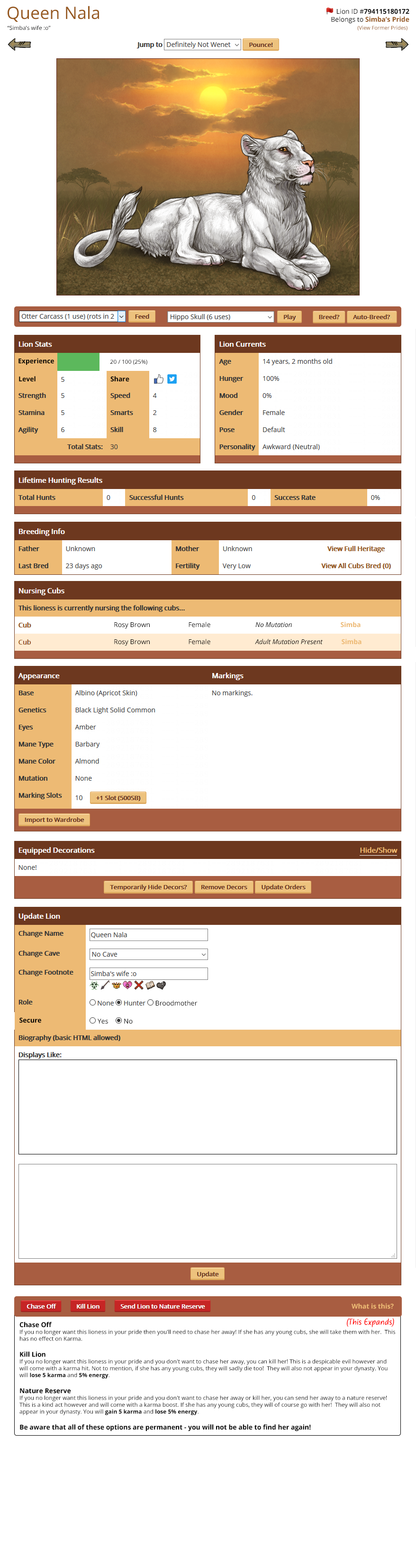
Hello everyone! Earlier in the year we discussed various convenience updates we wanted to make around the site. One of those included adjustments to the Lion Page to make it easier to feed, play and breed lions. I have come up with a preview of how we'd like to move things around to make them a bit easier, and we'd really like your opinions on whether anything could be more streamlined and easier to access. What are the most important things to you that you'd like to see implemented or changed? What other changes should we make? Link to Lion Page Mockup New position for social media buttons * This is a big file, I would advise not opening it using mobile data. |
 Report
|
Zhaitan (#137231)
Toxic View Forum Posts Posted on 2018-08-10 14:46:34 |
I really like this new layout, especially having the option to play, feed and breed your lion right at the top. It was so annoying to go through my entire pride when I was low on amusement toys and constantly being shot back up to the top each time. I particularly don't like how the experience bar and level is all scrunched in there with the lion's stats. I like to see it in full and know how much longer it'll take for me to level her up, but having it scrunched up in there -though clean- would seem a bit troublesome if you know what i mean. Other than that, i really like the new design.  0 players like this post! Like? 0 players like this post! Like? |
|
._. (#153736)
Good Natured View Forum Posts Posted on 2018-08-10 14:59:00 |
|
Malokia [PFM] (main) (#88471)
Heavenly View Forum Posts Posted on 2018-08-10 15:05:43 |
My thoughs: Name, ID, pride should stay centered. Like, the name/footnote IS important and centered is better layout. If not, at least the name/note in center and pride/jump maybe to the sides. I'm fine with feed/play in this position, but where did "interact" went? Very Good with exp over the stats and level, I believe level up button will be there as well? I dont really care much for social-sharing, they way it was before was fine for me. Definately DON'T want to see it in the stats. (yea, the 2nd picture is better) Hunting Results should be beneath breeding/appearance. I think Id even see appearance right after stats/currents so its less scrolling. Big up for nursing cubs, I like more info. And good for chase/kill/send to reserve, looks more in order. 0 players like this post! Like? |
|
Ali (#80161)
King of the Jungle View Forum Posts Posted on 2018-08-10 15:41:24 |
I think it is over all pretty good but 1- keep the lion's name/ID/ETC centered (where it currently is) 2- not really a big deal but maybe switch Lion Currents and Lion Stats 3- Keep the chase/kill/reserve the way it is The bottom aren't really a big deal but I really hope the name can stay the way it is 0 players like this post! Like?Edited on 10/08/18 @ 15:47:53 by Ali (#80161) |
|
solusfaust (#148949)
Heavenly View Forum Posts Posted on 2018-08-10 15:44:33 |
Please make as many things as you can expandable / collapsible! ESPECIALLY the lion biographies. They can sometimes be SOOO long and incredibly frustrating to scroll through. 0 players like this post! Like? |
|
Cerrates (TheEbonyPanther) (#49783) View Forum Posts Posted on 2018-08-10 16:15:43 |
The chase/kill/reserve buttons seem worryingly close to the "update" button.....but I suppose if you secure them then its ok. Just makes me nervous. I love how the interactions are all at the top! Scrolling to breed every time is so tiring lol. I do personally like the way the name and pride info is currently in the middle. Feels a little awkward to me for them to be in the corners. I also like adding more of the cub info. Very handy. :) 0 players like this post! Like? |

|
Laila 💰 (Gryffindor!) (#96222) 
Heavenly View Forum Posts Posted on 2018-08-10 16:17:22 |
I do not like the "Nursing Cub" thing because then it could ruin the surprise of a leopon if you're breeding one, but that's just me XD 0 players like this post! Like? |
|
Cerrates (TheEbonyPanther) (#49783) View Forum Posts Posted on 2018-08-10 16:44:28 |
@Lalia I thought of that too, but if you want a surprise, just click on the cubs to look at them through the den page instead of going to them through the mother. I like it showing on the mother's page because that way its easier to tell which cub is which and to know if you are about to chase a mother with a cub you want to keep. 0 players like this post! Like? |
|
Laila 💰 (Gryffindor!) (#96222)
Heavenly View Forum Posts Posted on 2018-08-10 17:21:31 |
|
Pasha (#5512)
King of the Jungle View Forum Posts Posted on 2018-08-10 18:08:32 |
Just some quick thoughts (and thank you for moving the interact buttons): –Nursing cubs could be combined with breeding info (under the same heading) –Hunting results could maybe be combined with stats –Share/like buttons could go next to the name or ID –Maybe biography could (optionally or not optionally) go on top, since visitors are pretty unlikely to scroll that far down? –View all cubs bred could go below current cubs or maybe could be changed to "view all descendants" I understand why devs tend to not be in favor of this, but individual account settings to move the different page sections around would make logical sense, considering the different play styles people have. For example, I have not thought about the hunting results section in years. (Has that even been relevant since hunting parties were introduced?) 0 players like this post! Like? |

|
Evelyn (#18370)
King of the Jungle View Forum Posts Posted on 2018-08-10 19:18:15 |
I hate the name portion of it above all else. I like how it is being centered and easy to read, with the footnote just under it. If you're going to change something about the page, don't make it this 0 players like this post! Like? |
|
Kala (#11761)
Incredible View Forum Posts Posted on 2018-08-10 23:28:55 |
I also agree with most of the changes also suggested by other users. I just don’t like how (in the lion page mock-up) the red flag symbol is so close to the lion id number that if you often highlight the id number one could accidentally click on the red flag symbol instead. 0 players like this post! Like? |
|
Slade (#36600)
Lone Wanderer View Forum Posts Posted on 2018-08-11 02:31:42 |
I like this new condensed idea! Can we get a fix on the FEED ALL PLAY ALL and have those buttons at the top of the page as well? That would be nice!  0 players like this post! Like? 0 players like this post! Like? |

|
YakyuuPiffle (#101248)
Magnificent View Forum Posts Posted on 2018-08-11 02:51:50 |
I would prefer name and footnote centered. And the ID/Belongs to/Former pride maybe under the lion image. The rest is perfect! 0 players like this post! Like? |
|
✧SandTiger✧ (#19265)
Phoenix View Forum Posts Posted on 2018-08-11 11:03:34 |
Topic is locked
Memory Used: 632.92 KB - Queries: 0 - Query Time: 0.00000 - Total Time: 0.00483s