|
|
|
|---|---|
| Posted by | -LOCKED - OPINIONS: Lion Page Adjustments |
 🌈 Abbey ⚡🦁 (#1) 
Usual View Forum Posts  Posted on 2018-08-03 05:43:24 |
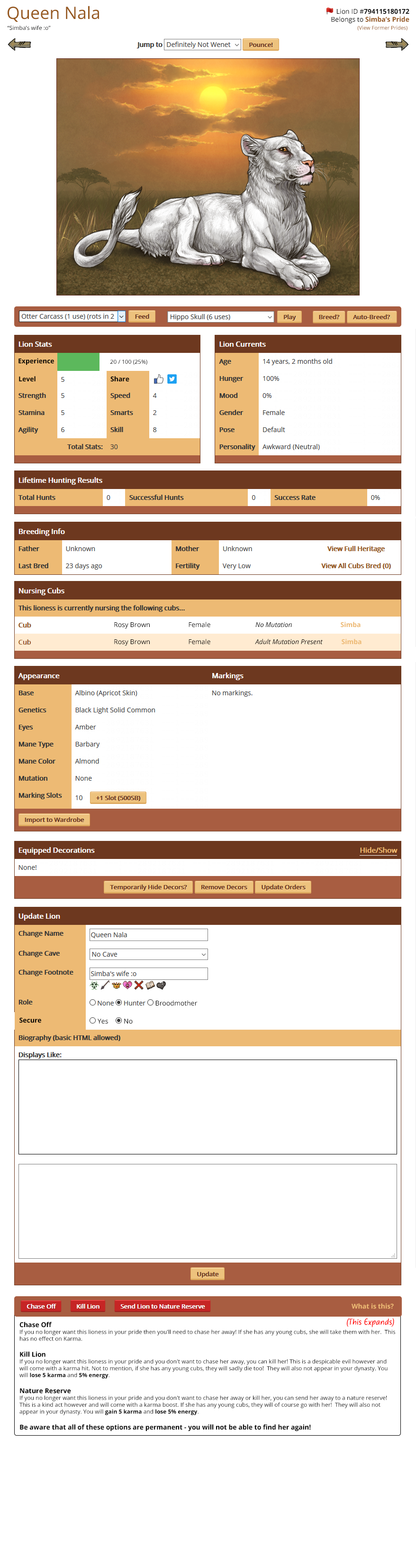
Hello everyone! Earlier in the year we discussed various convenience updates we wanted to make around the site. One of those included adjustments to the Lion Page to make it easier to feed, play and breed lions. I have come up with a preview of how we'd like to move things around to make them a bit easier, and we'd really like your opinions on whether anything could be more streamlined and easier to access. What are the most important things to you that you'd like to see implemented or changed? What other changes should we make? Link to Lion Page Mockup New position for social media buttons * This is a big file, I would advise not opening it using mobile data. |
 Report
|
Kohl (#20450)
View Forum Posts Posted on 2018-08-04 04:55:46 |
I support! I do also think the name should be centered. I also think that the appearance tab should be higher up, since it's one of the things that people pay attention to most. If it was right below lion stats and lion currents, that would be perfect.  0 players like this post! Like? 0 players like this post! Like? |
|
sarastallet99 (Ferus) Poop Me (#5285) Cursed View Forum Posts Posted on 2018-08-04 05:16:56 |
The feed/play/breed buttons looks great on the mockup, so does the kill/send/chase ones :) The only things I thought about was the name of the lion and Id placement, I think it's better the way it is now when both ate centered above the lion. And aslo I think the experience bar looks really out of place there.. Mainly I think that the thing that bothers me with this is that it cuts of the orange part of the lion stats and that makes it look loke something is missing 0 players like this post! Like? |
Shad (#16848)

Wanderer View Forum Posts Posted on 2018-08-04 05:22:17 |
I support, I really like the idea of adding the support button in this position: https://prnt.sc/ke9esj 0 players like this post! Like? |

|
Ratby {G1 Madagascar Rift} (#141856)
Buzzkill View Forum Posts Posted on 2018-08-04 06:15:02 |
I agree that the name, ID, and what pride it belongs to should stay centered! 0 players like this post! Like? |

|
Equagga|G5 Harbinger DHR Felis (#105402)
Blessed View Forum Posts Posted on 2018-08-04 06:48:01 |
So happy to see all of the 'interact'-type actions right at the top. This will make daily care so much easier when I've got to do it on mobile! Love it. The only thing I think is too far down is appearance. I consider that more vital than some of the other boxes personally. If I'm looking at a lion for sale or a stud, I would like not having to scroll much to get to that block. Maybe stat/currents - hunting results - appearance - breeding info - nursing cubs - rest of page as is? I wish hunting results could be moved further down, too, but it makes sense to keep it near stats since it's involved with them. Edit: would also like to note my support of keeping names & notes centered, and for play/tussle/groom to be the default interaction in the play box. 0 players like this post! Like?Edited on 04/08/18 @ 06:56:34 by 🦓 E-quagga 🦓 (#105402) |

|
Aster (#145103)
Phoenix View Forum Posts Posted on 2018-08-04 07:02:12 |
CALA (#105146)

View Forum Posts Posted on 2018-08-04 07:03:19 |
@Leaf it is next to the broodmother option in the description box now. 0 players like this post! Like? |

|
Moonflower🌙 {Skyward} (#28410)
Bone Collector View Forum Posts Posted on 2018-08-04 07:20:32 |
The name and pride Information absolutely needs to be centered. Having it separated out like that makes me bones itch. Honestly the only thing I would change about the way they currently are is move interact up higher, and condense some of the wordier options into smaller/expandable boxes. It doesn’t need a total revamp, just some slight tweaks would make it cleaner but still familiar and easy to work with. I’m largely a mobile user and interact/breed are the only ones I have problems with on this little phone, and even then I just zoom in. Hunting, on the other hand.....lmao 0 players like this post! Like? |
|
fortmax (#91111)
Toxic View Forum Posts Posted on 2018-08-04 07:20:40 |

|
🍄wormwood🌈 (#142785)
Sapphic View Forum Posts Posted on 2018-08-04 07:32:30 |
support, but would it still function on mobile? and keeping the name/id/pride centered would be nicer 0 players like this post! Like? |

|
Spectre [CLEAN Pied Spectre] (#8680)
Majestic View Forum Posts Posted on 2018-08-04 08:19:06 |
I too feel the name and pride info should remain centered above the lion, otherwise, I love the would be adjustments! 0 players like this post! Like? |
|
Shakshouka (#140969)
Renowned View Forum Posts Posted on 2018-08-04 08:25:19 |
I like this! As a couple other people have said though, I like it better with the names centered (it looks a bit odd with that empty space there) and I don't use items to play with my lions so scrolling down to tussle is still going to be inconvenient, but this is still much better than how it is now! Support! 0 players like this post! Like? |
|
EntityofSilo | G4 (#107570)
Badland Strider View Forum Posts Posted on 2018-08-04 08:32:16 |
My only problems are with the heading not being centered, the XP bar location, and the height of the appearance section on the page. I do agree with what E-Quagga said earlier (currents --> hunting --> appearance --> breeding info --> nursing cubs --> decors --> bio --> kill/chase/reserve); I feel like the lion appearance is referred to a lot more than some of the other things on a lion's page and should be higher up for convenience. As for the XP bar location, could it be attached to the bottom of the hunting bar? As hunting is the main way to level up a lioness, I feel like the XP bar should remain in close proximity with the hunting bar :) I absolutely love the new XP bar though! (Then I noticed how it says 20/100 (25%). My day has grown exponentially brighter xD) 0 players like this post! Like? |
|
DesertPard (G2 DorsalFur RLC) (#147400) Merciful View Forum Posts Posted on 2018-08-04 08:53:38 |
I also agree that hunts should be moved down and appearance should be moved up. I pay more attention to appearance and breeding info than the other two. But I'm super happy that the interaction option will be near the top now. Thanks! 0 players like this post! Like? |
|
Lirr' (#116518)
Majestic View Forum Posts Posted on 2018-08-04 09:00:05 |
I support but feel like, with a lot of other people, that the name and footnotemail should stay in the center as well as keeping an interact button as I also like to preserve my items since it isn't needed with my kings personality 0 players like this post! Like? |
Topic is locked
Memory Used: 632.95 KB - Queries: 0 - Query Time: 0.00000 - Total Time: 0.00412s